set.seed(1)
x <- round(runif(10, 1, 5), 3)
y <- 0.7 + 0.5 * log(x - 1) + rnorm(10, sd = 0.2)
df <- data.frame(x, y)
ggplot(df, aes(x, y)) +
    geom_point() +
    xlim(1, 5) +
    ylim(-1, 2)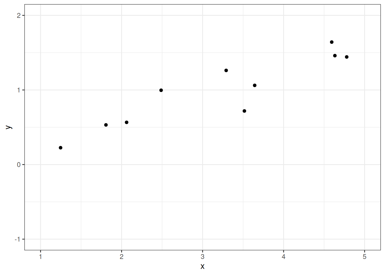
Regression is a class of statistical techniques to understand the relationship between an outcome variable (also called a criterion/response/dependent variable) and one or more predictor variables (also called explanatory/independent variables). For example, if we have the following scatter plot between two variables (\(Y\) and \(X\)):
set.seed(1)
x <- round(runif(10, 1, 5), 3)
y <- 0.7 + 0.5 * log(x - 1) + rnorm(10, sd = 0.2)
df <- data.frame(x, y)
ggplot(df, aes(x, y)) +
geom_point() +
xlim(1, 5) +
ylim(-1, 2)
We want to find some pattern in this relationship. In conventional regression, we model the conditional distribution of \(Y\) given \(X\), \(P(Y \mid X)\), by separating the outcome variable \(Y\) into (a) a systematic component that depends on the predictor, and (b) a random/probabilistic component that does not depend on the predictor. For example, we can start with a systematic component which only depends on the predictor:
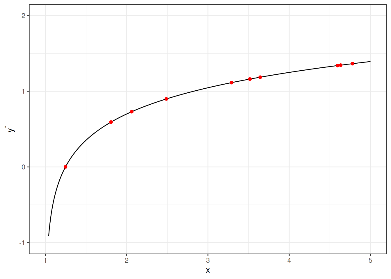
As you can see, all the red dots fall exactly on the curve in the graph above, meaning that as long as one knows the \(X\) value, one can predict the \(Y\) value with 100% accuracy. We can thus write \(Y^* = f(X)\) (where \(Y^*\) is the systematic component of \(Y\)).
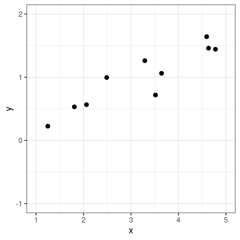
However, in almost all scientific inquiries, one can never predict with 100% certainty (e.g., there are measurement errors and college randomness in physics). The uncertainty stems from the fact that we rarely measure all the factors that determine \(Y\), and there are genuinely random things (as in quantum physics). Therefore, we need to expand our model to incorporate this randomness by adding a probabilistic component. Therefore, instead of saying that \(Y\) depends just on \(X\), we say \(Y\) is random, but the information about \(X\) provides information about how \(Y\) is distributed. In regression, one studies the conditional distribution \(P(Y \mid X)\) such that the conditional expectation, \(E(Y \mid X)\), is determined by \(X\); on top of the conditional expectation, we assume that the observed \(Y\) values scatter around the conditional expectations, like the graph on the left below:
ggplot(df, aes(x, yhat)) +
    stat_function(fun = function(x) 0.7 + 0.5 * log(x - 1), n = 501) +
    geom_point(col = "red") +
    xlim(1, 5) +
    ylim(-1, 2) +
    ylab("y") +
    geom_curve(aes(x = x, y = yhat + 0.5, xend = x, yend = yhat - 0.5),
        curvature = -0.4, col = "red", linetype = "dotdash"
    ) +
    geom_vline(aes(xintercept = x), linetype = "dotted") +
    geom_point(aes(x, y), size = 2)
ggplot(df, aes(x, y)) +
    geom_point(size = 2) +
    xlim(1, 5) +
    ylim(-1, 2)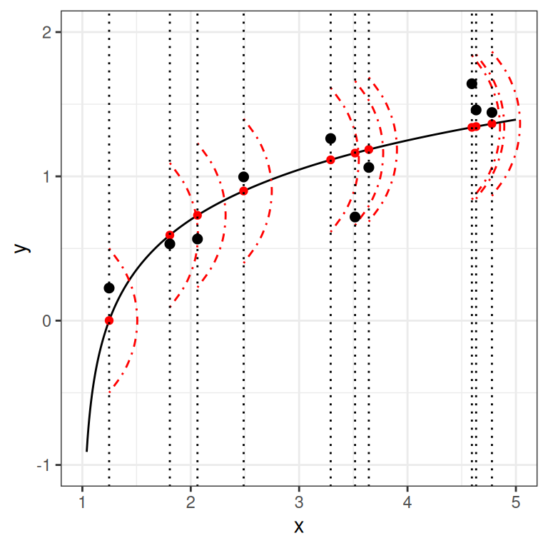
We can write the systematic part as:
\[E(Y \mid X) = f(X; \beta_1, \beta_2, \ldots), \]
where \(\beta_1\), \(\beta_2\), \(\ldots\) are the parameters for some arbitrary function \(f(\cdot)\). The random part is about \(P(Y \mid X)\), which can take some arbitrary distributions. In reality, even if such a model holds, we do not know what \(f(\cdot)\) and the true distribution of \(Y \mid X\) are, as we only have data like those illustrated in the graph on the right above.
The linear regression model assumes that
Under these conditions, we have a model
\[ \begin{aligned} Y_i & \sim N(\mu_i, \sigma) \\ \mu_i & = \eta_i \\ \eta_i & = \beta_0 + \beta_1 X_{i} \end{aligned} \]
With parameters:
We will use an example based on the “bread and peace” model by political scientist Douglas Hibbs, which can be used to forecast the U.S. presidential election outcome based on some weighted metric of personal income growth. The example is taken from chapter 7 of the book Regression and Other Stories.1
Figure 8.2 is a graph showing the data from 1952 to 2012, with one variable being personal income growth in the four years prior to an election, and the other being the vote share (in %) of the incumbent’s party.
# Economy and elections data
if (!file.exists("data/hibbs.dat")) {
    download.file(
        "https://github.com/avehtari/ROS-Examples/raw/master/ElectionsEconomy/data/hibbs.dat",
        "data/hibbs.dat"
    )
}
hibbs <- read.table("data/hibbs.dat", header = TRUE)ggplot(hibbs, aes(x = growth, y = vote, label = year)) +
geom_point() +
ggrepel::geom_text_repel() +
labs(x = "Average recent growth in personal income",
y = "Incumbent party's vote share (%)")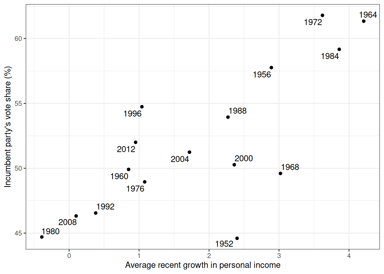
Model:
\[ \begin{aligned} \text{vote}_i & \sim N(\mu_i, \sigma) \\ \mu_i & = \beta_0 + \beta_1 \text{growth}_i \end{aligned} \]
\(\sigma\): SD (margin) of prediction error
Priors:
\[ \begin{aligned} \beta_0 & \sim N(45, 10) \\ \beta_1 & \sim N(0, 10) \\ \sigma & \sim t^+_4(0, 5) \end{aligned} \]
Once you’ve written the model, it’s straightforward to code the model in Stan to perform MCMC sampling, like the code below.
data {
  int<lower=0> N;  // number of observations
  vector[N] y;  // outcome;
  vector[N] x;  // predictor;
  int<lower=0,upper=1> prior_only;  // whether to sample prior only
}
parameters {
  real beta0;  // regression intercept
  real beta1;  // regression coefficient
  real<lower=0> sigma;  // SD of prediction error
}
model {
  // model
  if (!prior_only) {
    y ~ normal(beta0 + beta1 * x, sigma);
  }
  // prior
  beta0 ~ normal(45, 10);
  beta1 ~ normal(0, 10);
  sigma ~ student_t(4, 0, 5);
}
generated quantities {
  // Prior/posterior predictive
  array[N] real ytilde = normal_rng(beta0 + beta1 * x, sigma);
}
linear_reg <- cmdstan_model("stan_code/linear_reg.stan")m1_prior <- linear_reg$sample(
data = list(N = nrow(hibbs),
y = hibbs$vote,
x = hibbs$growth,
prior_only = TRUE),
seed = 1227, # for reproducibility
refresh = 1000
)Running MCMC with 4 sequential chains...
Chain 1 Iteration: 1 / 2000 [ 0%] (Warmup)
Chain 1 Iteration: 1000 / 2000 [ 50%] (Warmup)
Chain 1 Iteration: 1001 / 2000 [ 50%] (Sampling)
Chain 1 Iteration: 2000 / 2000 [100%] (Sampling)
Chain 1 finished in 0.0 seconds.
Chain 2 Iteration: 1 / 2000 [ 0%] (Warmup)
Chain 2 Iteration: 1000 / 2000 [ 50%] (Warmup)
Chain 2 Iteration: 1001 / 2000 [ 50%] (Sampling)
Chain 2 Iteration: 2000 / 2000 [100%] (Sampling)
Chain 2 finished in 0.0 seconds.
Chain 3 Iteration: 1 / 2000 [ 0%] (Warmup)
Chain 3 Iteration: 1000 / 2000 [ 50%] (Warmup)
Chain 3 Iteration: 1001 / 2000 [ 50%] (Sampling)
Chain 3 Iteration: 2000 / 2000 [100%] (Sampling)
Chain 3 finished in 0.0 seconds.
Chain 4 Iteration: 1 / 2000 [ 0%] (Warmup)
Chain 4 Iteration: 1000 / 2000 [ 50%] (Warmup)
Chain 4 Iteration: 1001 / 2000 [ 50%] (Sampling)
Chain 4 Iteration: 2000 / 2000 [100%] (Sampling)
Chain 4 finished in 0.0 seconds.
All 4 chains finished successfully.
Mean chain execution time: 0.0 seconds.
Total execution time: 0.6 seconds.m1_prior$draws("ytilde", format = "matrix") |>
ppc_ribbon(y = hibbs$vote, x = hibbs$growth,
y_draw = "points") +
labs(x = "Average recent growth in personal income",
y = "Incumbent party's vote share (%)") +
coord_cartesian(ylim = c(0, 100))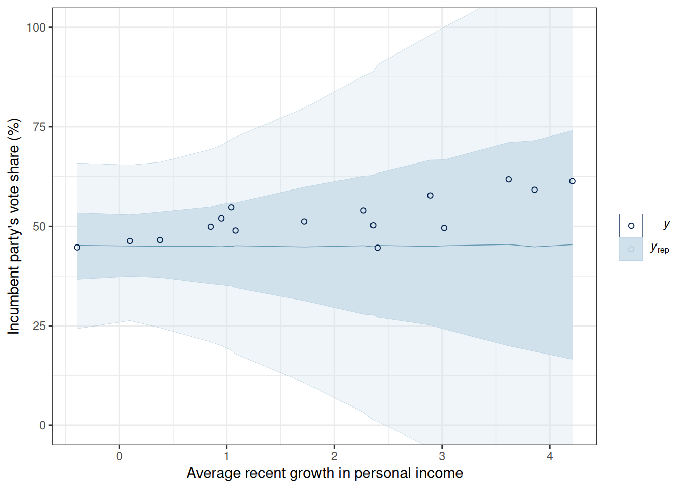
We can also visualize the prior regression lines based on the prior distributions:
prior_draws_beta <- m1_prior$draws(c("beta0", "beta1"), format = "data.frame")
ggplot(hibbs, aes(x = growth, y = vote, label = year)) +
    geom_point() +
    geom_abline(data = prior_draws_beta, aes(intercept = beta0, slope = beta1),
    linewidth = 0.1, alpha = 0.1) +
    ggrepel::geom_text_repel() +
    labs(x = "Average recent growth in personal income",
         y = "Incumbent party's vote share (%)") +
    coord_cartesian(ylim = c(0, 100))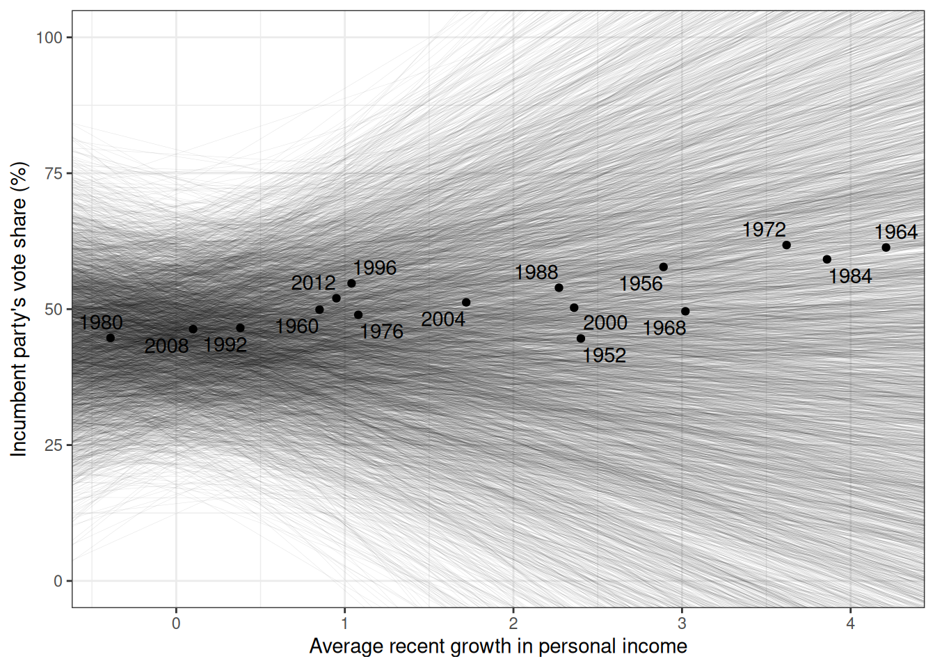
We’ll now fit the model (without prior_only = TRUE).
m1_post <- linear_reg$sample(
    data = list(N = nrow(hibbs),
                y = hibbs$vote,
                x = hibbs$growth,
                prior_only = FALSE),
    seed = 1227,  # for reproducibility
    refresh = 1000
)
Running MCMC with 4 sequential chains...
Chain 1 Iteration: 1 / 2000 [ 0%] (Warmup)
Chain 1 Iteration: 1000 / 2000 [ 50%] (Warmup)
Chain 1 Iteration: 1001 / 2000 [ 50%] (Sampling)
Chain 1 Iteration: 2000 / 2000 [100%] (Sampling)
Chain 1 finished in 0.0 seconds.
Chain 2 Iteration: 1 / 2000 [ 0%] (Warmup)
Chain 2 Iteration: 1000 / 2000 [ 50%] (Warmup)
Chain 2 Iteration: 1001 / 2000 [ 50%] (Sampling)
Chain 2 Iteration: 2000 / 2000 [100%] (Sampling)
Chain 2 finished in 0.0 seconds.
Chain 3 Iteration: 1 / 2000 [ 0%] (Warmup)
Chain 3 Iteration: 1000 / 2000 [ 50%] (Warmup)
Chain 3 Iteration: 1001 / 2000 [ 50%] (Sampling)
Chain 3 Iteration: 2000 / 2000 [100%] (Sampling)
Chain 3 finished in 0.0 seconds.
Chain 4 Iteration: 1 / 2000 [ 0%] (Warmup)
Chain 4 Iteration: 1000 / 2000 [ 50%] (Warmup)
Chain 4 Iteration: 1001 / 2000 [ 50%] (Sampling)
Chain 4 Iteration: 2000 / 2000 [100%] (Sampling)
Chain 4 finished in 0.0 seconds.
All 4 chains finished successfully.
Mean chain execution time: 0.0 seconds.
Total execution time: 0.5 seconds.m1_summ <- m1_post$summary(c("beta0", "beta1", "sigma"))
# Use `knitr::kable()` for tabulation
knitr::kable(m1_summ, digits = 2)| variable | mean | median | sd | mad | q5 | q95 | rhat | ess_bulk | ess_tail |
|---|---|---|---|---|---|---|---|---|---|
| beta0 | 46.25 | 46.26 | 1.73 | 1.66 | 43.42 | 49.06 | 1 | 1582.97 | 1590.35 |
| beta1 | 3.05 | 3.06 | 0.75 | 0.71 | 1.83 | 4.26 | 1 | 1605.18 | 1745.88 |
| sigma | 4.03 | 3.91 | 0.78 | 0.70 | 2.97 | 5.48 | 1 | 2047.68 | 2056.33 |
The parameter estimates are shown in Table 13.1. Here’s a paragraph for the results:
The model predicts that when personal income growth is 0, the vote share for the incumbent party is 46%, 90% CI [43%, 49%]. A 1-unit difference in personal income growth corresponds to a difference in vote share by 3 percentage points, 90% CI [1.8, 4.3].
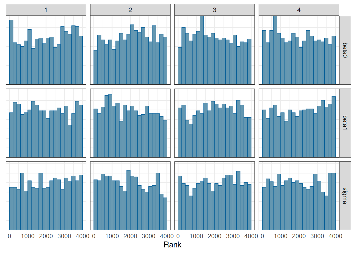
We will talk about convergence more in a future week. For now, you want to see that
m1_post_draws <- m1_post$draws(c("beta0", "beta1", "sigma"))
mcmc_trace(m1_post_draws)
mcmc_rank_hist(m1_post_draws)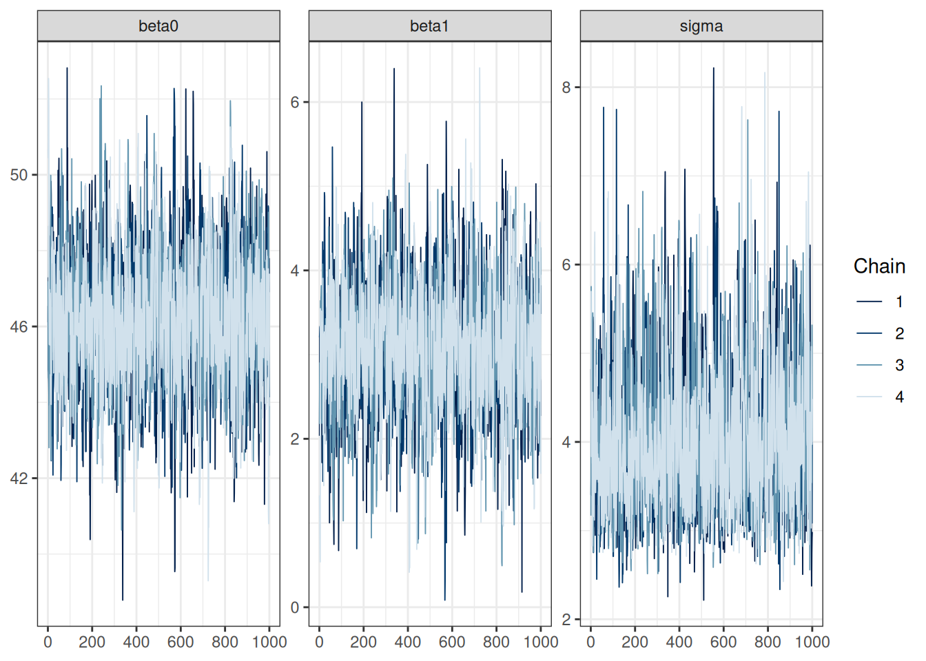
There are many ways to visualize the results of a regression model. The most important thing is to be as familiar with what the results mean as possible. Statistics is not magic that gives you numbers that either support or do not support your theory or hypothesis. It is a way to describe your data. If you do not want to do the work to understand what your data tell you, why bother to collect the data in the first place?
Posterior distributions of the three parameters
mcmc_dens(m1_post_draws)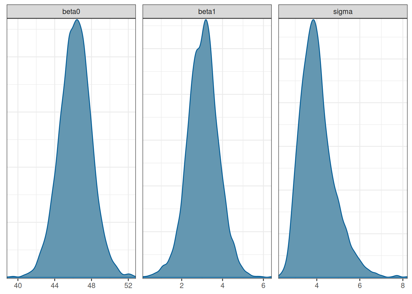
You can also combine the density plot and the trace plot
mcmc_combo(m1_post_draws)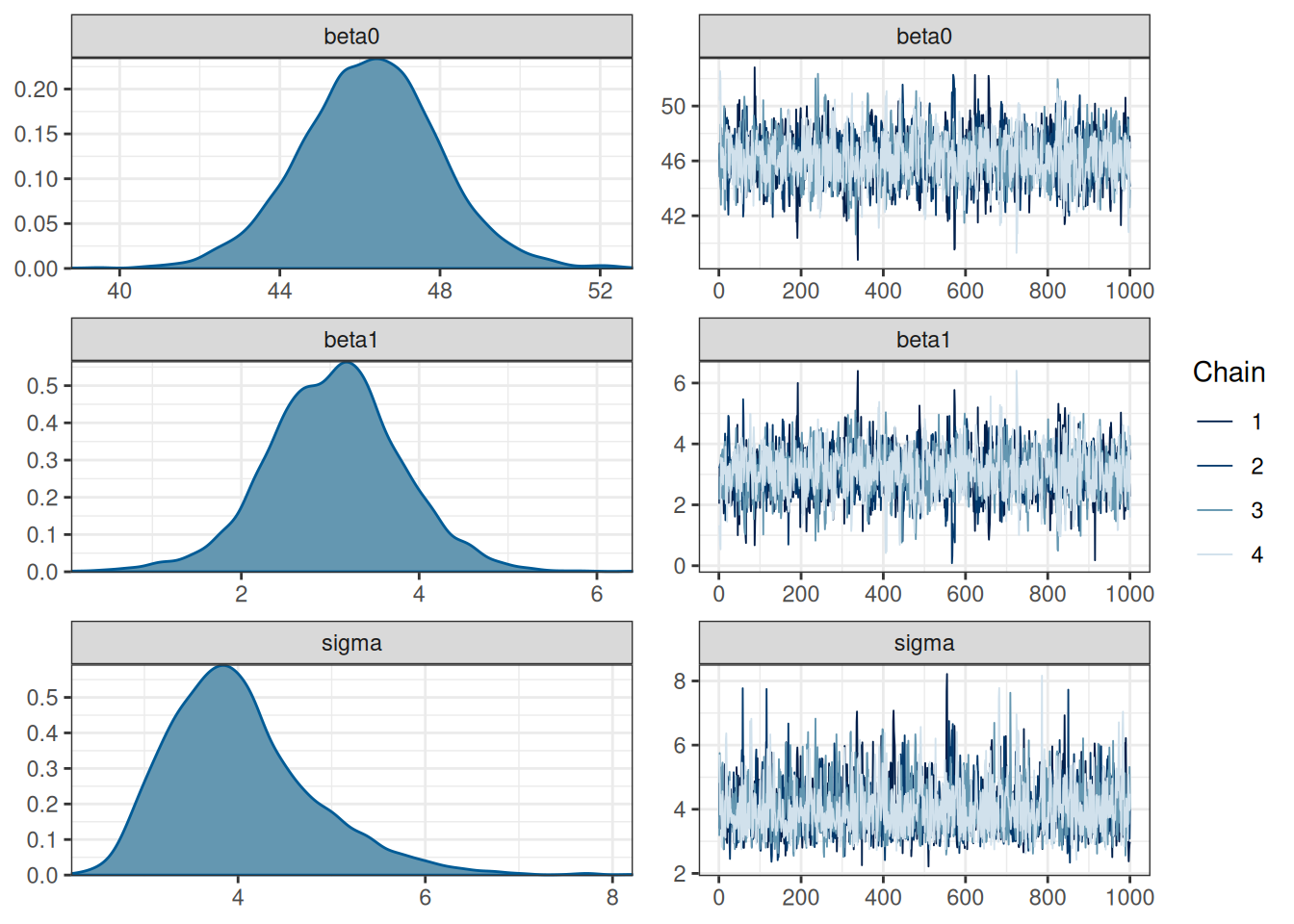
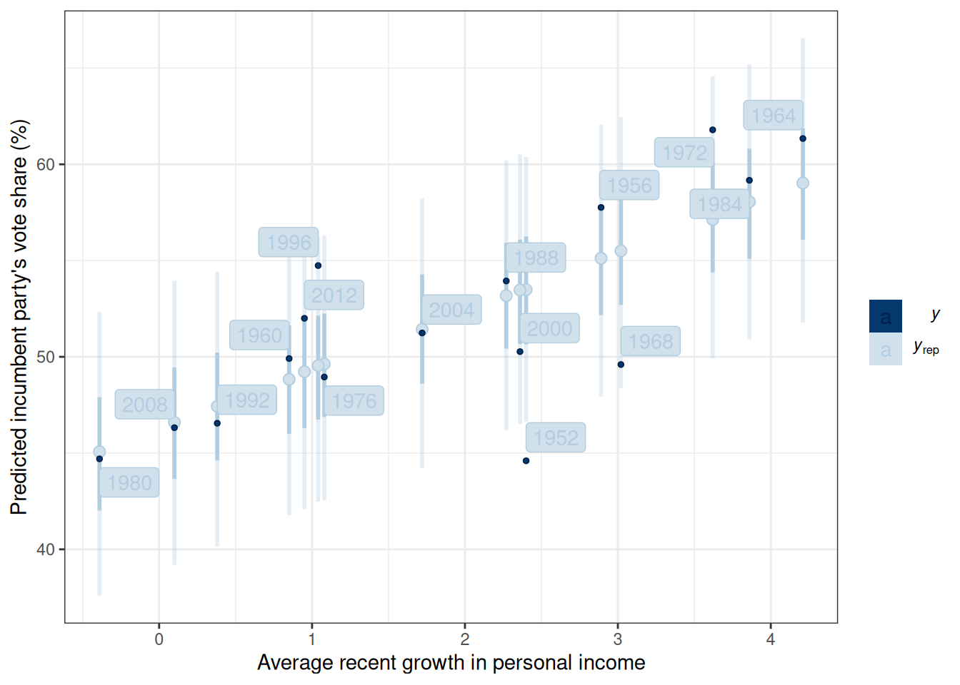
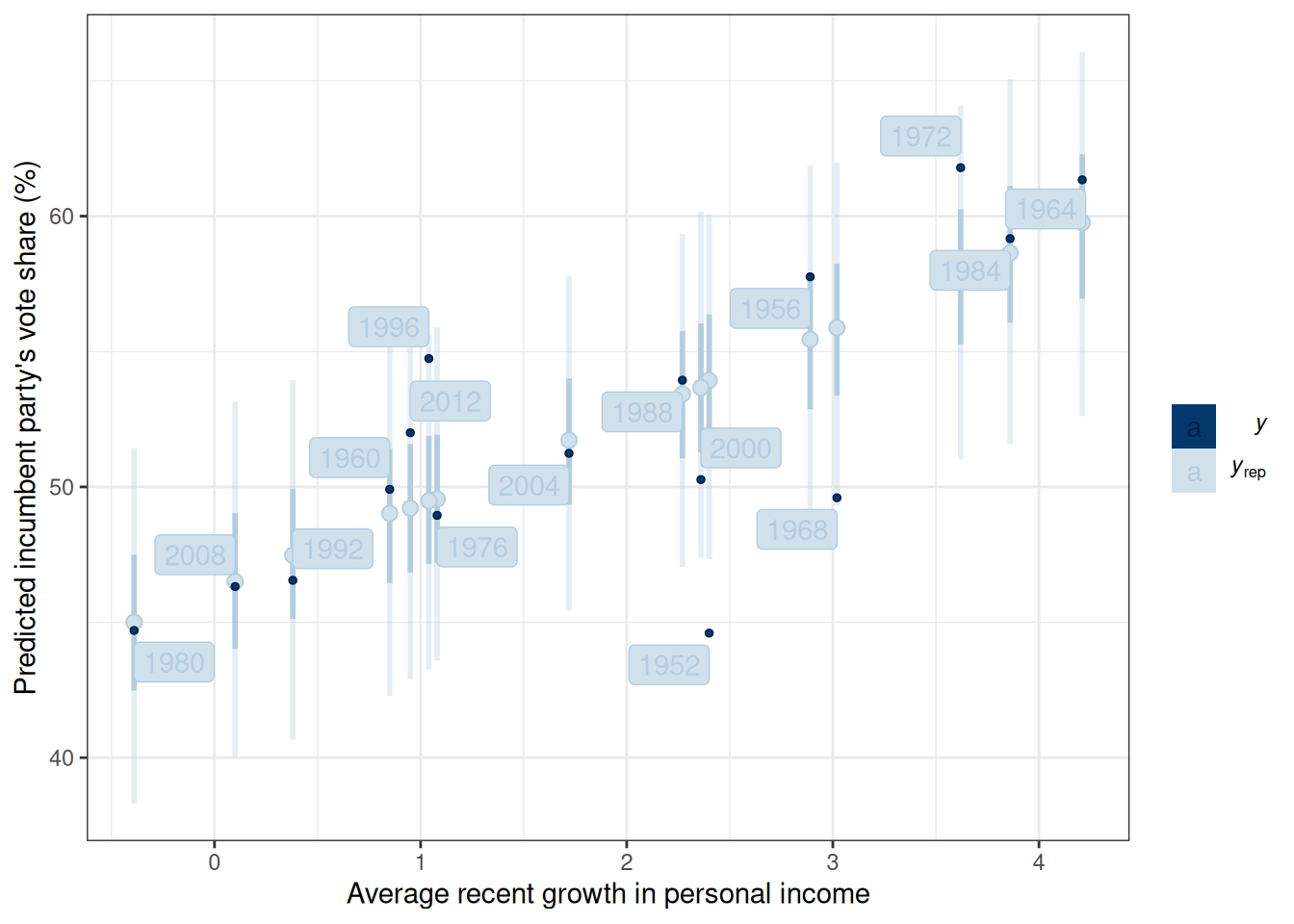
Figure 13.4 shows the 50% and 90% prediction intervals based on the posterior samples and the model. For example, with the 90% intervals, one expects 90% of the data should be within those intervals. If many data points lie outside the intervals, the linear model is not a good fit.
m1_post$draws("ytilde", format = "matrix") |>
    ppc_intervals(y = hibbs$vote, x = hibbs$growth) +
    labs(x = "Average recent growth in personal income",
         y = "Predicted incumbent party's vote share (%)") +
    ggrepel::geom_label_repel(
        aes(y = hibbs$vote, label = hibbs$year)
    )
In the four years before 2016, the weighted average personal income growth was 2.0 (based on Hibbs’ calculation). So, based on the model, we can obtain a posterior distribution for the predicted vote share of the Democratic Party, which is the incumbent party prior to the 2016 presidential election.
linear_pred <- cmdstan_model("stan_code/linear_reg_pred.stan")m1_pred <- linear_pred$sample(
data = list(N = nrow(hibbs),
y = hibbs$vote,
x = hibbs$growth,
prior_only = FALSE,
xpred = 2),
seed = 1227, # for reproducibility
refresh = 1000
)Running MCMC with 4 sequential chains...
Chain 1 Iteration: 1 / 2000 [ 0%] (Warmup)
Chain 1 Iteration: 1000 / 2000 [ 50%] (Warmup)
Chain 1 Iteration: 1001 / 2000 [ 50%] (Sampling)
Chain 1 Iteration: 2000 / 2000 [100%] (Sampling)
Chain 1 finished in 0.0 seconds.
Chain 2 Iteration: 1 / 2000 [ 0%] (Warmup)
Chain 2 Iteration: 1000 / 2000 [ 50%] (Warmup)
Chain 2 Iteration: 1001 / 2000 [ 50%] (Sampling)
Chain 2 Iteration: 2000 / 2000 [100%] (Sampling)
Chain 2 finished in 0.0 seconds.
Chain 3 Iteration: 1 / 2000 [ 0%] (Warmup)
Chain 3 Iteration: 1000 / 2000 [ 50%] (Warmup)
Chain 3 Iteration: 1001 / 2000 [ 50%] (Sampling)
Chain 3 Iteration: 2000 / 2000 [100%] (Sampling)
Chain 3 finished in 0.0 seconds.
Chain 4 Iteration: 1 / 2000 [ 0%] (Warmup)
Chain 4 Iteration: 1000 / 2000 [ 50%] (Warmup)
Chain 4 Iteration: 1001 / 2000 [ 50%] (Sampling)
Chain 4 Iteration: 2000 / 2000 [100%] (Sampling)
Chain 4 finished in 0.0 seconds.
All 4 chains finished successfully.
Mean chain execution time: 0.0 seconds.
Total execution time: 0.5 seconds.m1_pred$draws("ypred") |>
mcmc_dens()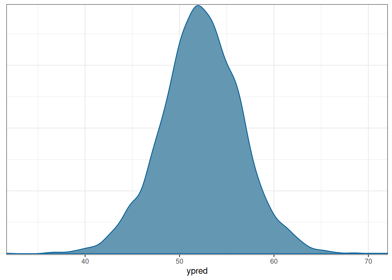
The mean of the incumbent’s predicted vote share with average income growth = 2 is 52.3006575. The actual outcome of the election was that the Democratic Party received about 51.1% of the votes among the two parties, so it was below the posterior predictive mean but within the range of possible outcomes. Of course, we know that the actual election outcome is based on the Eelectoral College, not the majority vote.
The linear model assuming normally distributed errors is not robust to outliers or influential observations. It can be robustified by assuming a more heavy-tailed distribution, such as the \(t\) distribution:
\[ \text{vote}_i \sim t_\nu(\mu_i, \sigma), \]
where \(\nu\) is an additional degrees of freedom parameter controlling for the “heaviness” of the tails. When \(\nu\) is close to 0 (e.g., 3 or 4), the outliers/influential cases are weighed less; when \(\nu\) is close to infinity, the \(t\) distribution becomes a normal distribution.
With Bayesian methods, we can let the model learn from the data about the \(\nu\) parameter. In this case, we assume a hyperprior for \(\nu\); \(\mathrm{Gamma}(2, 0.1)\) is something recommended in the literature.
data {
  int<lower=0> N;  // number of observations
  vector[N] y;  // outcome;
  vector[N] x;  // predictor;
  int<lower=0,upper=1> prior_only;  // whether to sample prior only
}
parameters {
  real beta0;  // regression intercept
  real beta1;  // regression coefficient
  real<lower=0> sigma;  // SD of prediction error
  real<lower=1> nu;  // df parameter
}
model {
  // model
  if (!prior_only) {
    y ~ student_t(nu, beta0 + beta1 * x, sigma);
  }
  // prior
  beta0 ~ normal(45, 10);
  beta1 ~ normal(0, 10);
  sigma ~ student_t(4, 0, 5);
  nu ~ gamma(2, 0.1); // prior for df parameter
}
generated quantities {
  vector[N] ytilde;  // place holder
  for (i in 1:N)
    ytilde[i] = normal_rng(beta0 + beta1 * x[i], sigma);
}
robust_reg <- cmdstan_model("stan_code/robust_reg.stan")m1_robust <- robust_reg$sample(
data = list(N = nrow(hibbs),
y = hibbs$vote,
x = hibbs$growth,
prior_only = FALSE),
seed = 1227, # for reproducibility
refresh = 0
)Running MCMC with 4 sequential chains...
Chain 1 finished in 0.0 seconds.
Chain 2 finished in 0.0 seconds.
Chain 3 finished in 0.0 seconds.
Chain 4 finished in 0.0 seconds.
All 4 chains finished successfully.
Mean chain execution time: 0.0 seconds.
Total execution time: 0.5 seconds.m1r_summ <- m1_robust$summary(c("beta0", "beta1", "sigma", "nu"))
# Use `knitr::kable()` for tabulation
knitr::kable(m1r_summ, digits = 2)| variable | mean | median | sd | mad | q5 | q95 | rhat | ess_bulk | ess_tail |
|---|---|---|---|---|---|---|---|---|---|
| beta0 | 46.17 | 46.18 | 1.55 | 1.45 | 43.55 | 48.64 | 1 | 1628.35 | 1673.90 |
| beta1 | 3.20 | 3.22 | 0.69 | 0.66 | 2.01 | 4.30 | 1 | 1598.75 | 1914.04 |
| sigma | 3.56 | 3.49 | 0.92 | 0.83 | 2.20 | 5.10 | 1 | 1044.24 | 586.21 |
| nu | 18.26 | 14.64 | 13.86 | 11.60 | 2.97 | 45.62 | 1 | 1234.64 | 638.30 |
m1_robust$draws("ytilde", format = "matrix") |>
    ppc_intervals(y = hibbs$vote, x = hibbs$growth) +
    labs(x = "Average recent growth in personal income",
         y = "Predicted incumbent party's vote share (%)") +
    ggrepel::geom_label_repel(
        aes(y = hibbs$vote, label = hibbs$year)
    )
See https://douglas-hibbs.com/background-information-on-bread-and-peace-voting-in-us-presidential-elections/ for more information on the “bread and peace” model.↩︎